
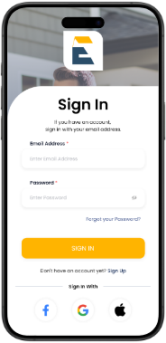
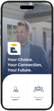
The app connects clients and real estate agents, promoting personalized transactions through tailored profiles. It emphasizes transparency, efficiency, and communication, making the real estate process more accessible and organized.
The app allows users to reserve and activate golf carts, with real-time route planning and zone alerts for safety and compliance with approved areas.
The app allows dual user types (guests and property owners) to reserve carts linked to vacation homes or independent units, offering flexibility and streamlined admin approval.
The app provides a convenient rental experience with electronic agreement signatures, automated check-in/out reminders, support access, and ride history tracking, enhancing user engagement and convenience.
Skelto is a real estate app that connects clients and agents for personalized, transparent, and organized transactions
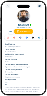
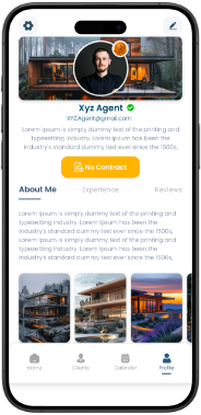
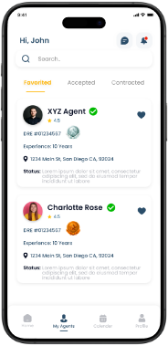

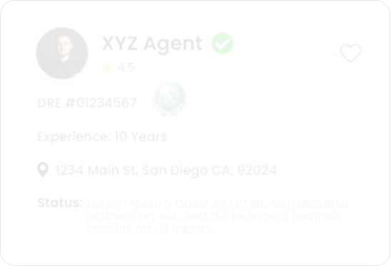
Clients can use filter functionality to refine their search for nearby agents profiles by location, experience, and distance, enabling them to find professionals they're interested in networking with.
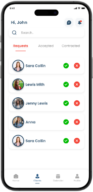
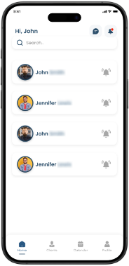
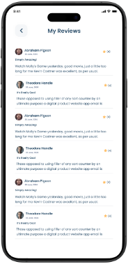
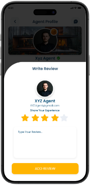
This section displays user-added agents, allowing users to view their profiles, send messages, and view and rate their experiences with these agents.

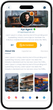
Users can chat with the agents from here in which along with the message they can also add attachments as well.

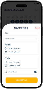
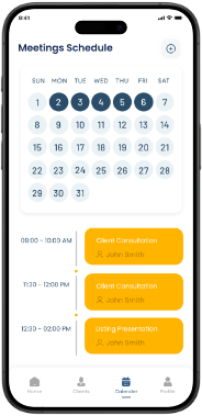
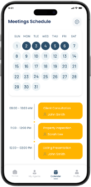
Users can add a meeting that they have in the upcoming days and that meeting will be reflected in the calendar that is visible in this section.
The steps taken from the preliminary development considerations to the final release of the app.

A brief overview of the target audience, their needs, and how the product is tailored to solve their specific problems or improve their daily experience.
An outline of the strategic and technical decisions made during development—platform selection, architecture, tools, and methodologies that shaped the foundation of the app.
A deep dive into the visual and user experience design—color schemes, branding, UI components, and how the design was crafted to be intuitive, engaging, and aligned with user behavior.
Details on how complexity was reduced in both user flows and functionality—ensuring ease of use, smooth navigation, and minimal learning curve across all user types.
Insights into the testing phase—how the app was tested with users, what feedback was collected, how bugs were resolved, and how usability improvements were made based on real user input.
An explanation of the systems or features used to monitor app performance, user behavior, and data insights post-launch—helping stakeholders track success and usage trends.
Describes the delivery process—how documentation, admin tools, or training were provided to clients or stakeholders, ensuring a smooth transition and operational readiness.
A section dedicated to the app’s future roadmap—plans for updates, new features, continuous feedback loops, and the long-term vision for evolving the platform.
Showcases the app’s unique selling points and differentiators—what makes it memorable, competitive, and valuable in its industry or market.
1
Who’s It For2
Choosing How to Build3
Designing the Look4
Making it Simple5
Testing & Feedback6
Keeping Track7
Handing Over8
Always Improving9
Helping It Stand OutPartner with CMOLDs and turn your app idea into reality with expert app developers and designers on deck!